CCCreaticast LabThe Feed · Design
Stream Overlays 101: What You Need and What to Skip
New streamers tend to make the same mistake with overlays: they add everything. Every widget, every animated corner, every "recent follower" ticker they can find. The result looks busy, hides the game, and quietly signals "I just started." Here's how to do the opposite.
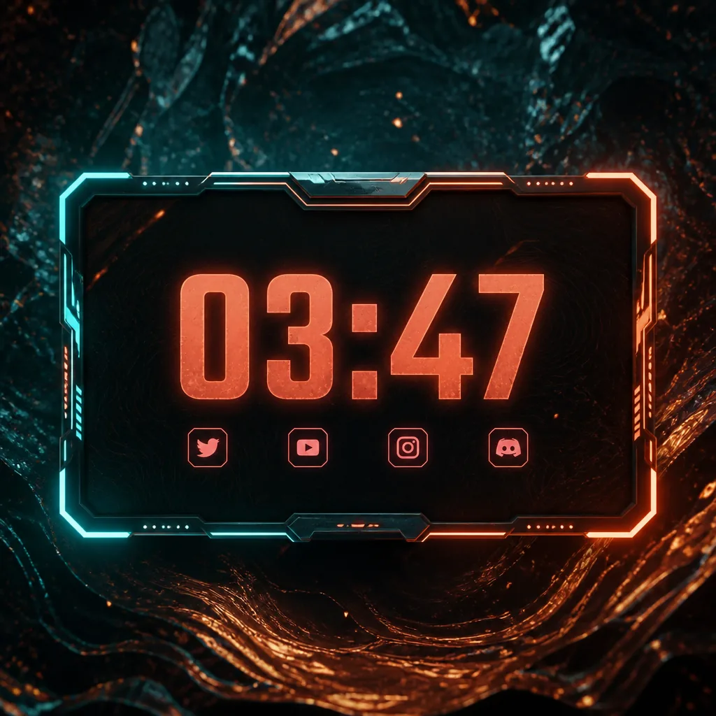
First, what an overlay actually is
An overlay is the layer of graphics that sits on top of your video — the border around your webcam, the little name tag, the "starting soon" screen before you go live. It's the frame around the painting. When it's done right, viewers barely notice it; they just feel like they're watching something that has its act together.
The trap is treating the overlay like the show. It isn't. You and your content are the show. Everything on screen should either help a viewer understand what's happening or get out of the way.
The pieces you genuinely need
Strip it back to a short list and you'll be ahead of most channels:
- A webcam frame. A simple, clean border that separates your face-cam from the gameplay behind it. It doesn't need to sparkle. It needs to be legible at small sizes.
- Scene screens. "Starting soon," "be right back," and "stream over." These are the three moments viewers stare at the longest, so they're worth getting right — a clear title, your channel name, and maybe a line about what's coming up.
- A name/handle tag. One small, persistent label so someone landing mid-stream knows whose channel they're in.
- Alerts. A tidy pop for a new follower or supporter. One style, used consistently. (We go deep on these in the alerts and scenes guide.)
That's it. Four things, done cleanly, look more professional than fourteen things fighting each other.
The clutter to skip (at least at first)
Here's what new streamers reach for that they almost never need on day one:
- A live chat box on screen. If people want your chat, it's already in the panel next to your video. Mirroring it over your gameplay just covers the game and doubles the reading.
- Goal bars for every metric. A follower goal, a sub goal, a donation goal, a "help me buy a new mic" bar — stacked together they turn your screen into a fundraising thermometer. Pick one, if any.
- Animated everything. Looping flames, pulsing borders, spinning logos. Motion draws the eye, and you want the eye on your content, not on a corner that never stops wiggling.
- A "latest follower / top supporter" ticker. Fine later, distracting now. It rewards a handful of names by cluttering the view for everyone else.
The readability rules that matter
Whatever you keep, run it past three quick checks. One: contrast. Text on your overlay has to be readable over a bright, moving game — that usually means a solid or semi-solid panel behind it, not thin white text floating on the action. Two: size. A lot of your audience watches on a phone. If your name tag is unreadable at thumbnail size, it's decoration, not information. Three: consistency. One accent colour, one font, one corner style across every scene. Matching pieces are what read as "professional"; a grab-bag of free downloads is what reads as "new."
How to get there without a design degree
You can absolutely build all of this yourself in an image editor — it just takes hours you might rather spend playing. That's exactly why we made the Overlay & Stream Toolkit: matching webcam frames, scene screens and alerts in three colour themes, already sized for 1080p and 1440p, ready to recolour with your accent and drop into OBS. You skip the blank-canvas paralysis and go straight to "does this look like me?"
Start minimal, keep it consistent, and add flair only once you know what your stream is actually about. A clean frame you're proud of beats a maximalist mess every single time.
Next up: Setting Up Alerts and Scenes in OBS Without the Headache →
← Back to home